Internet As It Should Be
Waoo
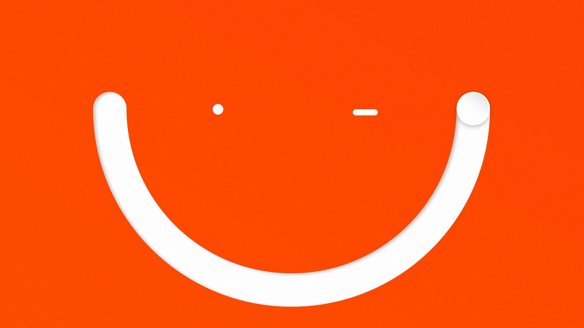
WAOO, a Danish internet and TV provider, stands out by challenging the ordinary with attitude, confidence, and curiosity. The creative direction for this project centered around a series of visual metaphors and icons that represent WAOO’s products.
These elements come together to form a distinct visual universe, positioning WAOO as a strong, independent brand. The playful and ever-evolving design reflects their cutting-edge identity, always staying ahead of the competition.
Working with design director Michael Mandrup, we were tasked with reimagining WAOO’s visual identity. Transitioning from a slapstick humor-driven advertising style to a more design-focused approach marked a significant shift for the brand.
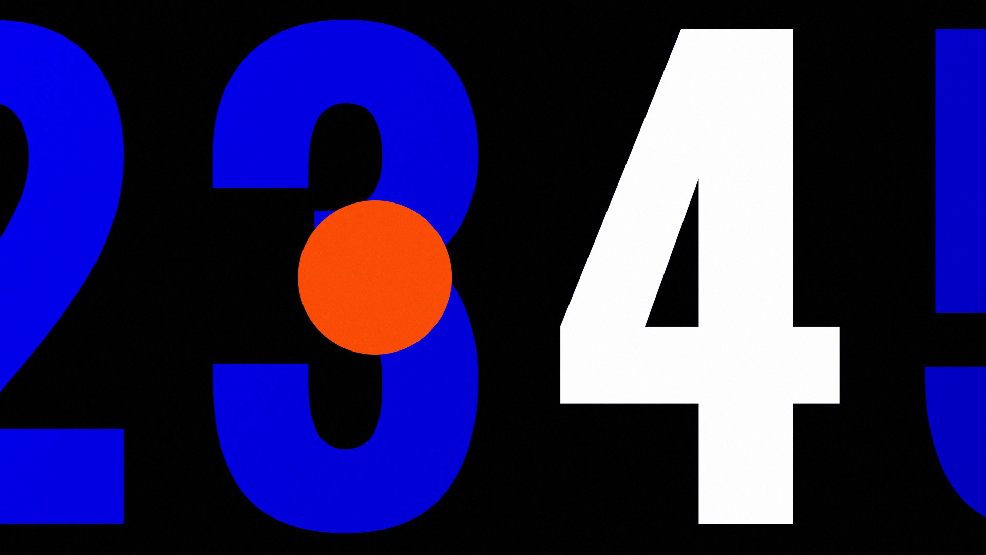
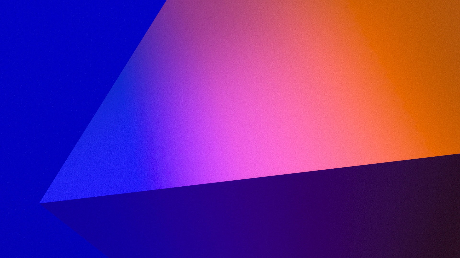
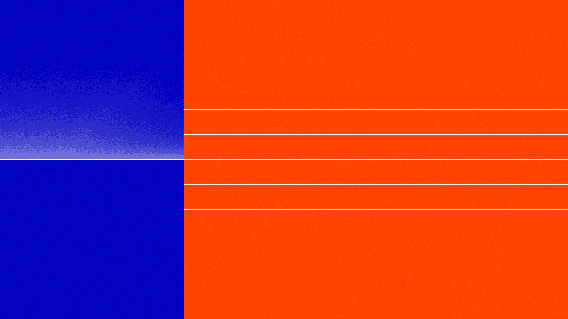
We ultimately developed a bold four-colour system that sets WAOO apart from its competitors. To bring this visual identity to life, we collaborated with the Copenhagen-based animation studio ccccccc. I had the privilege of working closely with Phillip Von Borries and Nicolaj Larsson, together developing the motion language that completes WAOO’s new look.
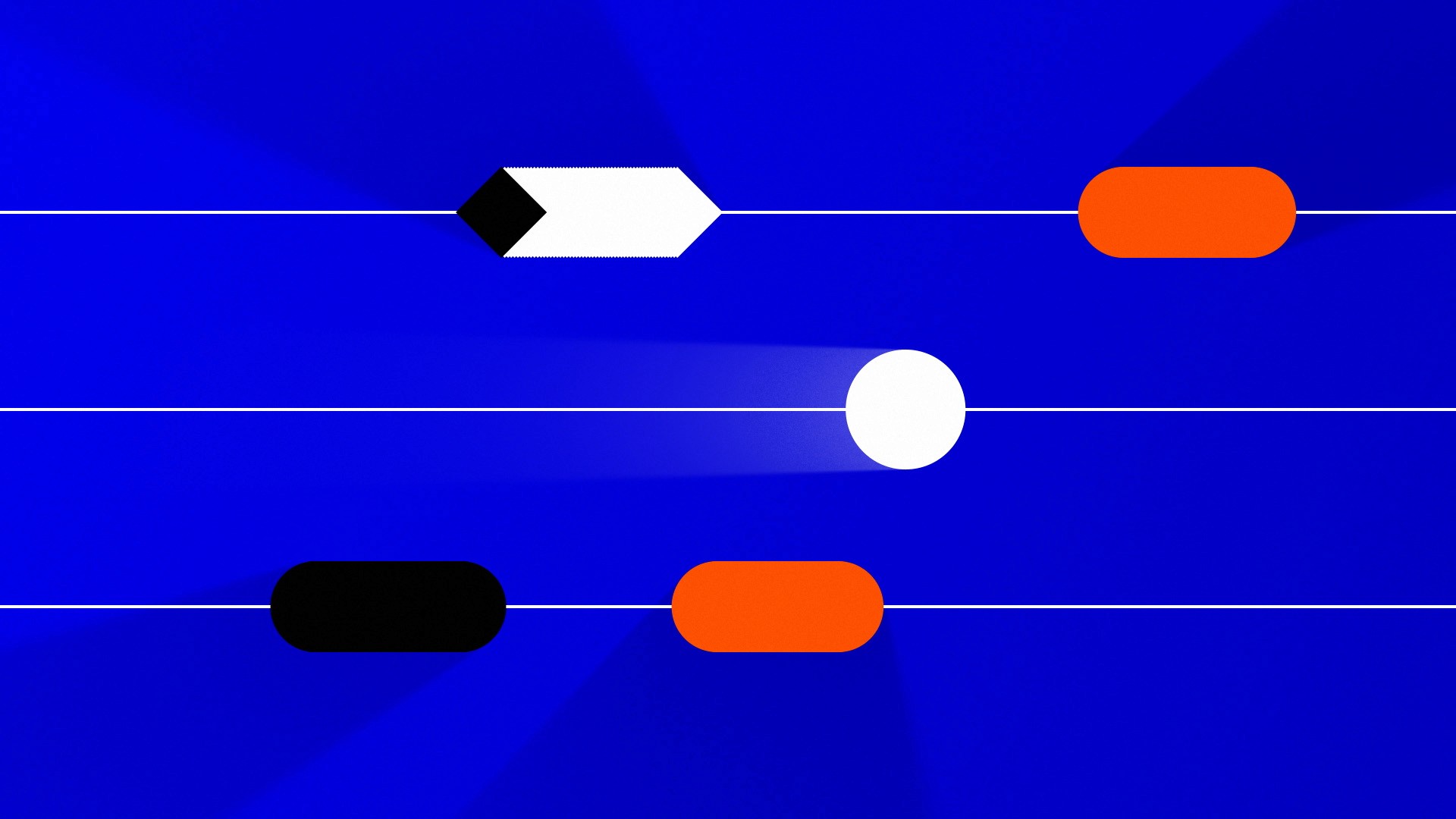
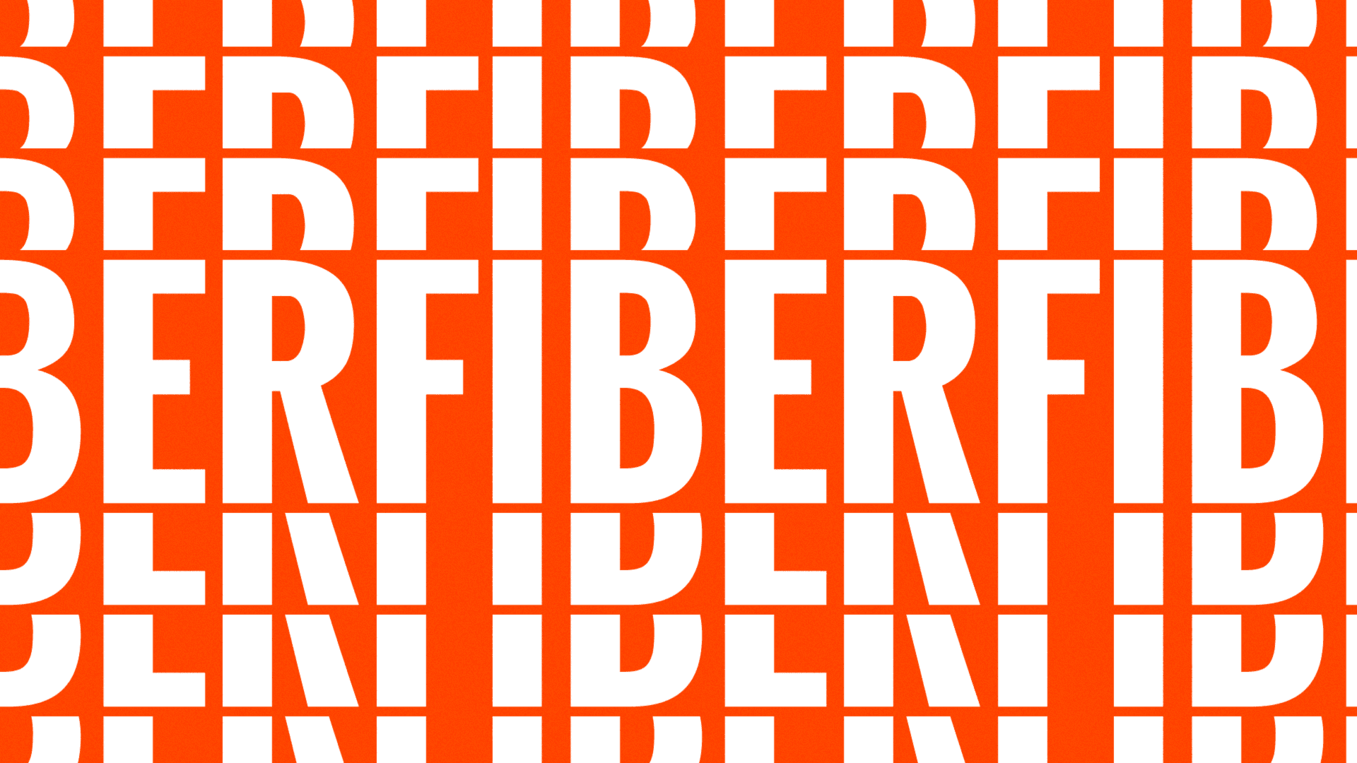
We developed a low-framerate motion system, utilizing the bold shapes and colours from the design system, to keep the films engaging and help them stand out in the advertising landscape.
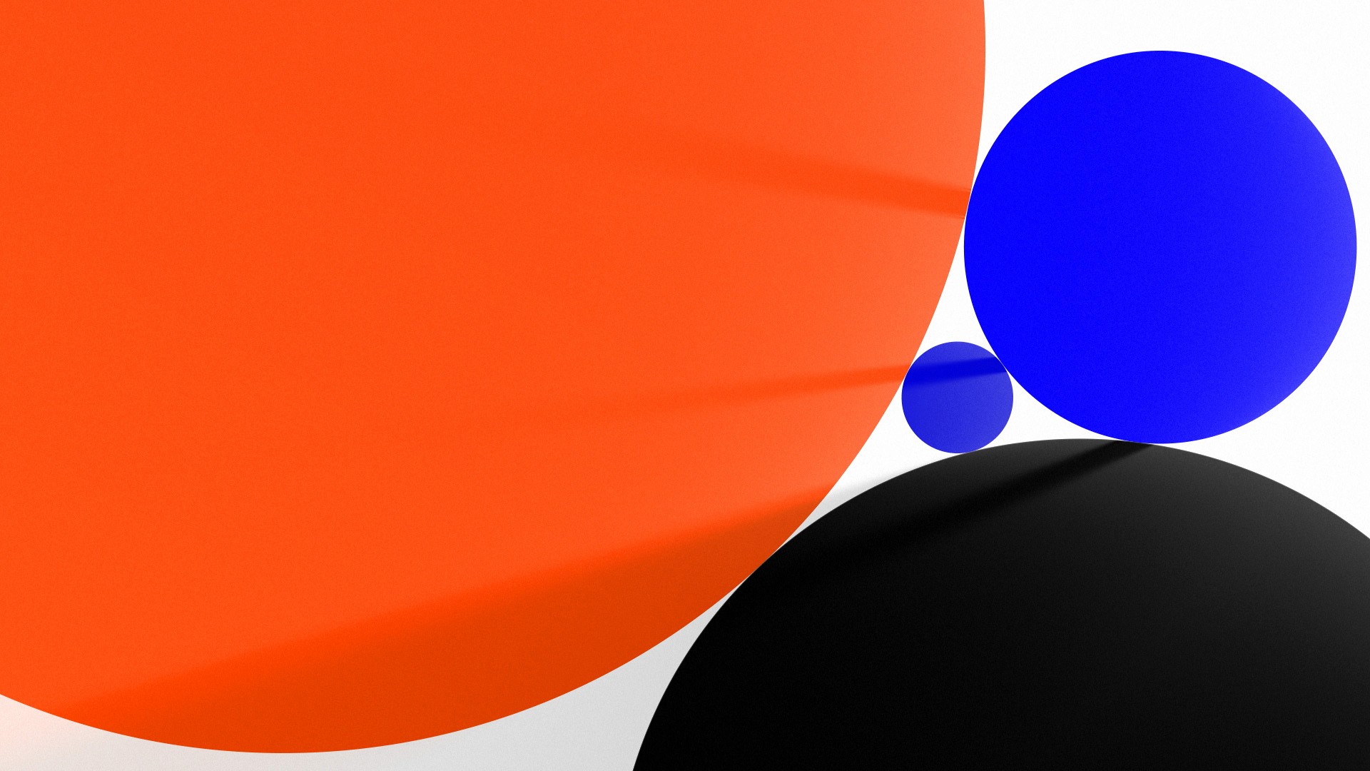
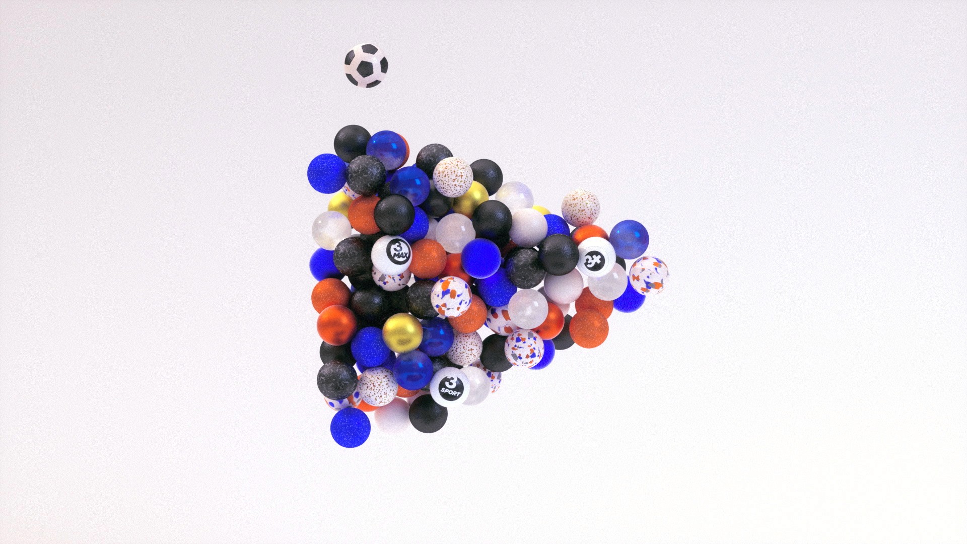
To further enhance the system, we teamed up with 3D studio Frame, adding an extra dimension to our universe with depth and shiny materials.
Stills
Process
Credits
Agency — Uncle Grey
Production — ccccccc, Frame & Uncle Grey
Design & Art Direction — Michael Mandrup
Creative Direction — Nicolaj Larsson & Michael Mandrup
Producer — Martin Axelsson & Thomas Bay
2D Animation — Philip von Borries & Mathias Nielsen
3D Animation — Frederik Wiedel, Jacob Linnemann, Martin Kundby, Mathias Nielsen, Rita Louro & Sacha Wechselmann
Lighting & Texturing — Rita Louro, Simon Kämpfer & Jacob Linnemann
Illustration — Philip von Borries & Mathias Nielsen
Copywriter — Kristian Skjoldborg
Sound Design — Sono Sanctus
Music — Andreas Asingh
